
How To Compare Competitor CTAs
Step-by-step guide to audit competitors' CTAs—analyze design, placement, messaging, tools, and A/B tests.
Your call-to-action (CTA) buttons can make or break your conversions. By analyzing competitors' CTAs, you can uncover proven strategies to improve your own. Here’s how:
- Identify competitors: Focus on 3-5 direct rivals and their high-traffic pages like homepages, pricing pages, and landing pages.
- Analyze design: Review button colors, sizes, fonts, and features like hover states, ensuring accessibility and mobile usability.
- Evaluate placement: Map where CTAs appear - hero sections, navigation bars, or sticky buttons - and align with user behavior patterns.
- Refine messaging: Study their wording for clear, action-driven verbs, benefits, and urgency cues like "Get started today."
- Use tools: Save time with competitor analysis tools to highlight gaps in design, placement, and messaging.
6-Step Process for Analyzing Competitor CTAs
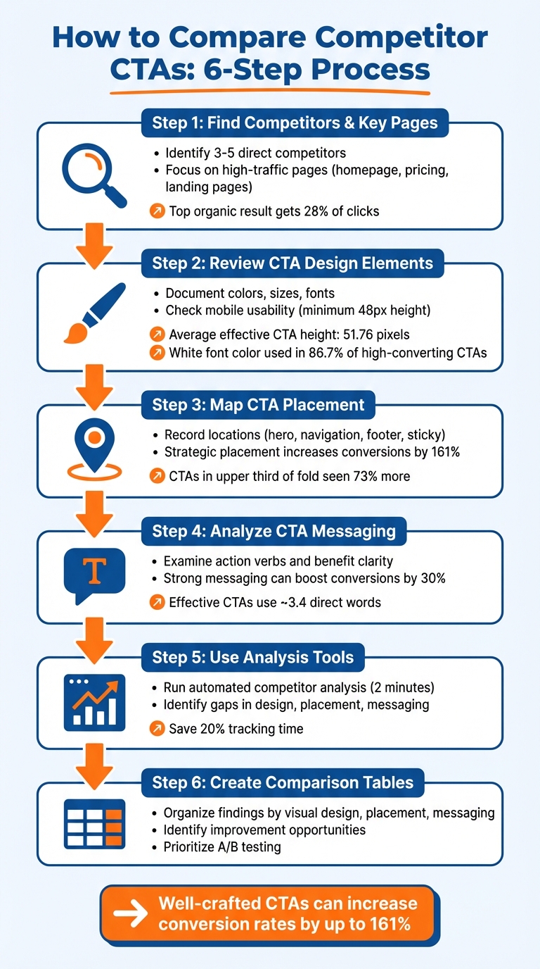
Step 1: Find Your Competitors and Their Key Pages
Before diving into analyzing CTAs (Calls to Action), narrow your focus to specific competitors and their most impactful pages. Instead of trying to study every player in your industry, concentrate on those who directly compete with you and the pages where their CTAs are most effective. This targeted approach helps you evaluate their CTA design, placement, and messaging in greater detail.
Choose 3-5 Direct Competitors
Start by identifying 3 to 5 direct competitors - companies offering similar products or services to the same audience. These are the businesses you're directly competing with, not every company in your industry. Use insights from your sales team to pinpoint the alternatives your prospects mention most often.
Google can also be a powerful tool here. Search your primary keywords and pay close attention to the top-ranking results. Why? The top organic result alone grabs about 28% of all clicks, making these sites crucial for analyzing CTAs. Additionally, explore platforms like G2, Capterra, and Product Hunt to find competitors operating in your niche.
"If you read a competitor's site as 'design', you see aesthetics. If you read it as 'data', you see strategy." - Seeto
Keep your list manageable - 5 to 10 competitors is ideal. Fewer than five might leave you missing key insights, while more than ten can overwhelm you with data. Focus on companies with a strong online presence, such as those actively running ads, ranking for commercial keywords, or expanding their teams in your industry.
Once you've identified your competitors, shift your attention to their high-traffic pages for a deeper analysis.
Locate High-Traffic Pages
After determining your competitors, the next step is to pinpoint their high-traffic pages - these are often where CTAs have the most impact. Pages like homepages (especially for brands with significant direct traffic), pricing pages, product pages, and dedicated landing pages are typically the most conversion-focused.
To find these pages, use tools like Semrush or Similarweb to generate "Top Pages" reports. These reports rank a competitor's URLs based on traffic volume. Focus on pages targeting transactional or commercial keywords, as these are more likely to drive conversions. Additionally, check out the Google Ads Transparency Center and Meta Ad Library to see which landing pages your competitors are actively promoting through paid campaigns.
Don’t overlook your competitors’ navigation menus either. Features that consistently appear in their top-level menus often highlight pages that attract the most traffic. And remember to review these pages on mobile devices - CTA placement and visibility can vary significantly between mobile and desktop experiences.
Once you’ve gathered this information, you’ll be ready to dive into how these pages use CTA design elements effectively.
Step 2: Review CTA Design Elements
Now that you've pinpointed your competitors' high-traffic pages, it's time to dig into the design details of their CTAs. The way a CTA looks - its color, size, and typography - can significantly influence click-through rates. By analyzing these elements, you can identify trends that work well in your industry and uncover areas where competitors might be missing the mark.
Document Visual Design Choices
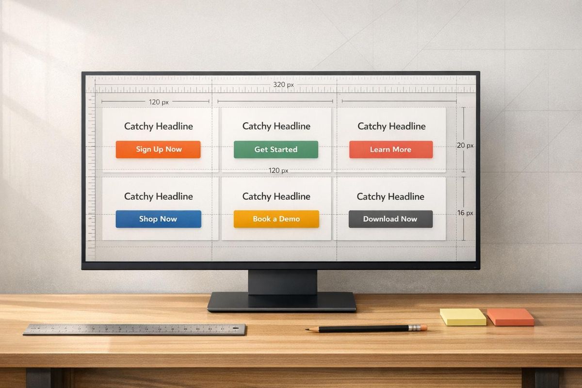
Start by noting the basic visual features of each CTA. Pay attention to the button's background color - popular choices like orange, blue, red, and green are often used because they create strong contrast against typical white or gray backgrounds. For font color, white is a dominant choice, appearing in 86.7% of high-converting CTAs due to its superior readability.
Don't overlook the size and spacing of the buttons. On average, effective CTAs are about 51.76 pixels tall, with a range between 22 and 83 pixels. Rounded corners, often about 30% of the button's height, make buttons feel more interactive and approachable. Also, check the horizontal padding; it usually equals about half the button's height, creating a visually balanced design.
Take note of how competitors distinguish between primary and secondary CTAs. For example, Loom emphasizes its primary "Get Loom for free" button with heavier colors and drop shadows, while secondary CTAs use lighter "ghost" styles (outlined buttons) to avoid drawing too much attention. Similarly, Glean's sticky navigation bar features a "Get a demo" button surrounded by a flashing neon border to keep it noticeable during long scrolling sessions.
Other details to record include text length and formatting. The ideal text length is between 2 to 4 words, and 43.3% of effective CTAs use all capitals - a stylistic choice rather than a performance driver. Interestingly, only 12.2% of CTAs include exclamation marks, indicating they don't significantly impact effectiveness.
Once you've documented these features, evaluate whether the CTAs are accessible and functional across different devices.
Check Accessibility and Usability
It's crucial to ensure competitor CTAs are mobile-friendly. Google recommends buttons be at least 48 pixels tall to avoid usability issues, which is slightly larger than the WCAG minimum of 44 pixels. Buttons smaller than this could lead to a frustrating mobile experience, giving you an opportunity to improve on their design. Additionally, if two CTAs are placed side by side, there should be at least 8 pixels of inactive space between them to prevent accidental clicks.
Test the color contrast of competitor CTAs using tools like Adobe Color or Contrast Checker to verify they meet WCAG accessibility standards. Poor contrast can result in a 50% drop in clicks because users may not even notice the button. For further testing, use a Color Vision Deficiency (CVD) simulator to check if color combinations, such as red and green, are distinguishable for users with color blindness.
Finally, assess the interactive features of CTAs. Use the tab key to navigate competitor sites and see if buttons have visible focus indicators for keyboard-only users. Check for hover states that slightly adjust brightness - about a 10% change is ideal - to make buttons feel responsive and "alive". These small interactions reassure users that their actions are being recognized, enhancing overall engagement.
Step 3: Map CTA Placement and Positioning
Once you've outlined the design for your CTAs, the next step is to figure out where to place them. Just like design and messaging, placement plays a huge role in how well your CTAs perform. For example, buttons placed in the upper third of the fold are seen 73% more often than those below. And when positioned strategically, CTAs can increase conversion rates by up to 161%.
Record CTA Locations
Start by jotting down where your CTAs will appear. Common spots include:
- Hero sections
- Navigation bars
- Mid-page areas
- Sidebars
- Footers
Also, consider sticky or floating CTAs that stay visible as users scroll. These are especially helpful for mobile users, keeping the action within easy reach of their thumbs.
Top-performing pages often repeat the main CTA in multiple places, especially after key sections like testimonials or feature breakdowns. This gives users several chances to act whenever they feel ready.
Once you’ve mapped out the locations, take a closer look at why you’ve chosen those spots. This evaluation is a core component of a competitive analysis framework designed to identify conversion gaps.
Review Placement Strategy
The best CTA placements align with how people naturally scan a page and where their attention is most likely to be captured. For example, layouts often follow scanning patterns like the Z-pattern for visuals or the F-pattern for text-heavy designs. Placing CTAs near key trigger points - like testimonials or pricing tables - can make them even more effective.
Above-the-fold CTAs tend to work well for quick, low-commitment offers, such as "Sign Up Free." On the other hand, CTAs at the bottom of the page are better for complex products, where users might need more information or social proof before taking action. Don’t overlook exit-intent pop-ups, either - they can help capture 10–15% of visitors who are about to leave. Together, these strategies create a well-rounded, effective CTA approach.
Step 4: Analyze CTA Messaging
Once you've mapped out where your CTAs are placed, the next step is to dive into the wording. The language on a CTA button can have a huge impact on its effectiveness - sometimes, even minor adjustments can lead to a 30% boost in conversion rates. To sharpen your approach, take a close look at how competitors craft their CTA messages and assess their persuasiveness.
Examine CTA Copy
Start by breaking down the exact wording competitors use. Strong CTAs rely on direct, action-packed verbs like "discover", "download", "join", or "get." These words create a sense of momentum and make it clear what the user should do. In contrast, weaker phrases like "learn more" lack that same energy and urgency.
Next, focus on whether the copy highlights a clear benefit. Vague commands like "Get started" don’t resonate as well as CTAs that spell out the payoff. For example, "Save 16 hours per month" or "Open an account for free" immediately answers the user's unspoken question: "What’s in it for me?" Including urgency cues like "now" or "today" can also encourage quicker action.
Don’t overlook trust signals. Elements like star ratings, testimonials, or security badges near the CTA can reassure users and strengthen the overall value proposition. Another key factor is personalization - many competitors tweak their CTAs based on user segments. For instance, the copy for new visitors might differ from that for returning leads, which can lead to better results.
"Direct CTA copy tends to perform better than lengthier CTA copy. Succinctly pitching the value of what you're linking out to on a page with an abundance of copy and visual distractions can act as an unambiguous directive on what readers should do once on the page." - AJ Beltis, Senior Content Marketing Manager, HubSpot
Compare Clarity and Effectiveness
Once you’ve analyzed the wording, evaluate the overall clarity and impact of the CTAs. Clear, concise language tends to work best. Research shows that effective CTAs typically use around 3.4 direct words to convey their message without unnecessary jargon. For instance, "Get pricing" performs better than ambiguous phrases like "Unlock the future" because it leaves no room for confusion.
To compare your competitors’ CTAs with your own, ask yourself a few key questions: Does the button clearly communicate the benefit or outcome? Is the action verb placed at the start so users immediately grasp what’s being asked? Does the CTA align with the headline on the landing page? Misalignment between the button text and the page content can derail conversions, even if the button design is appealing.
Look for recurring themes in your competitors’ CTAs. For example, if several companies use phrases like "No credit card required" or "Cancel anytime", they’re likely addressing common user concerns and reducing barriers to action. These patterns can clue you in on what resonates with your audience. On the flip side, you might spot opportunities to stand out - such as replacing generic "Get started" buttons with more specific, benefit-driven language.
| Evaluation Criteria | High Effectiveness | Low Effectiveness |
|---|---|---|
| Verb Choice | Direct and action-focused (Get, Download, Join) | Passive or generic (Learn more, Click here) |
| Value Prop | Highlights a clear benefit (Save 50%, Free Trial) | No tangible benefit mentioned |
| Urgency | Includes time-based cues (Now, Today, Limited Time) | Lacks urgency or timing |
| Specificity | Provides concrete outcomes (Save 10 hours) | Relies on vague buzzwords (Improve efficiency) |
| Clarity | Short and jargon-free | Long, unclear, or overly technical |
This analysis gives you a clear framework for identifying where your CTAs can improve and how to make them more compelling. By focusing on directness, benefits, and clarity, you’ll be better positioned to craft CTAs that drive action.
Step 5: Use Tools for Faster Analysis
Manually reviewing CTAs can take hours - or even days. By using automated tools, you can dramatically cut down on the time it takes to analyze design, placement, and messaging. Instead of spending endless hours gathering data, these tools allow you to focus on using the insights to improve your CTAs.
Run Analysis with Competitor Analysis Tool
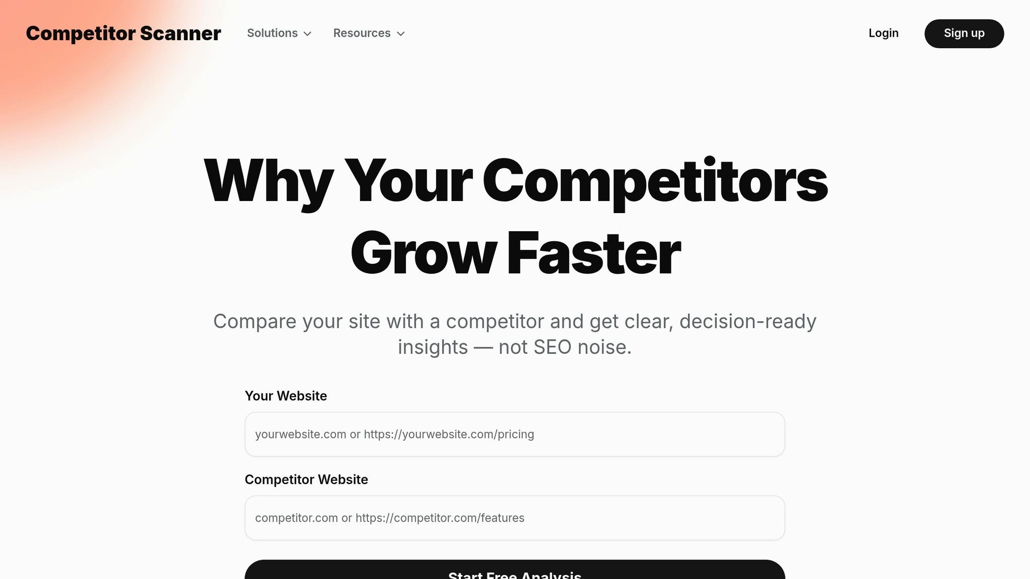
The Competitor Analysis Tool is a quick way to compare your website to a competitor's in just 2 minutes. All you need to do is enter your URL and your competitor's URL. The tool will then highlight gaps in areas like demand, messaging, and visibility. It also examines how CTAs are positioned, the language they use, and where your strategy might fall short compared to theirs.
This process doesn’t require SEO expertise or tedious spreadsheet work. Instead, it provides clear, actionable recommendations. For example, it may point out if your CTA copy is too generic or if your buttons are placed too far down the page. This tool makes it simple to identify trends across multiple competitors without needing to log every detail manually.
These insights pave the way for targeted improvements, which we’ll discuss next.
Review Recommendations
Once the analysis is complete, focus on the actionable insights provided. The tool will highlight specific gaps. For instance, if a competitor uses urgency-driven phrases like "Get started today" while your CTA says "Learn more", that difference will be flagged. It can also show if competitors are positioning CTAs directly after their value proposition - a tactic that aligns with the Fogg Behavior Model, which emphasizes triggering action when motivation is at its peak.
Use these findings to refine your CTAs. If competitors rely on urgency cues and outcome-focused verbs, adjust your messaging to address those gaps quickly. The idea is to implement changes based on proven strategies in your market - without wasting weeks on manual research.
Step 6: Create Comparison Tables
Once you've gathered detailed insights from analyzing competitor CTAs, it's time to organize that information into a straightforward comparison table. This will help you spot patterns and areas where your CTAs can be improved.
Set Up a Comparison Table
Start by creating a table with your brand in the first column and 3-5 competitors in the following columns. Use rows to break down key elements like color, text, placement, font, size, and action verbs. Add a "Gap Analysis" row to highlight differences, using visual markers like colored circles or checkmarks to flag areas that stand out - such as inconsistent font choices or button sizes that don't meet usability standards.
For better organization, group rows into categories like Visual Design, Placement, and Messaging to make comparisons easier. If you're evaluating mobile optimization, include a row to note how CTAs adjust for smaller screens. The goal is to make the table easy to scan while still being informative.
This table will become your go-to resource for identifying actionable improvements.
Identify Improvement Opportunities
Once the table is complete, study it for recurring trends. For instance, if most competitors use strong action verbs like "Get", "Start", or "Buy" - which are commonly found in successful CTAs - and your CTAs lean on softer or passive language, that's a clear area to improve. Make sure your CTAs align with best practices in contrast, placement, and design, and adapt based on what competitors are doing effectively.
Double-check that your buttons meet the recommended 48px minimum size for mobile usability. Use the table to prioritize changes, focusing first on strategies that most competitors are using successfully. After implementing adjustments, test variations through A/B testing to discover what resonates best with your audience.
Conclusion
Keeping up with competitor CTA analysis is no longer something you can revisit every few months. With buyer expectations and market dynamics shifting constantly, relying on quarterly updates just doesn’t cut it anymore. Many teams now use weekly automated alerts to track strategic changes and stay ahead of the curve. And given that sales teams face direct competition in 68% of deals while rating their competitive readiness at just 3.8 out of 10, staying informed about CTA trends can make or break your revenue goals.
The numbers don’t lie: well-crafted CTAs can increase conversion rates by up to 161%, and personalized CTAs drive 42% more conversions compared to generic ones. As Nathan Gouttegatat from Proven SaaS explains:
"The goal of competitive analysis isn't just to see what everyone else is doing. It's to find the intersection of what your customers need, what your competitors do poorly, and what your product does exceptionally well".
To stay competitive, establish a clear routine for your analysis. Consider these steps: review automated alerts weekly, update comparison tables monthly, and dive deep into a full analysis quarterly. Tools like the Competitor Analysis Tool can simplify this process by cutting tracking time by 20% and enabling teams to respond to market changes three times faster. This platform delivers actionable insights in under two minutes, helping you identify gaps in demand, messaging, and visibility - no SEO expertise required.
Once you’ve gathered insights, prioritize improvements. Use comparison tables to guide your focus, and run A/B tests to refine what works best for your audience. Address key areas like button size, action-oriented language, and mobile optimization, then measure the impact. By fine-tuning your CTA design, placement, and messaging, you’ll turn your strategy into a powerful tool for driving conversions.
FAQs
How do I choose the right competitors to analyze?
To choose the right competitors to analyze, begin by clearly defining your target market. Once that's done, categorize competitors into tiers based on their relevance to your business. Start with direct competitors - those offering similar products or services to the same audience. They provide the most actionable insights for refining your strategies.
Don't overlook indirect competitors, though. These are businesses addressing the same customer needs but with different solutions. Studying them can uncover untapped opportunities and alternative approaches. By focusing on competitors that most influence your market position, you can better prioritize your efforts and strategies.
What CTA changes should I test first to boost conversions?
Begin by experimenting with button color and wording, as these tend to have the most noticeable effect on conversions. Opt for high-contrast combinations, like white text on brightly colored backgrounds, to make buttons stand out. After that, test placement to ensure your CTAs are easy to spot and align with where users typically focus their attention. Small tweaks like these - adjusting color, text, and positioning - can significantly boost click-through rates and make your CTAs more effective.
How often should I redo competitor CTA research?
There isn’t a hard-and-fast rule for how often you should revisit competitor CTA research. However, keeping it updated is crucial because online strategies are always evolving. A good practice is to review your findings quarterly or whenever you notice major shifts in your industry or your competitors’ approaches. This way, your CTAs remain sharp, relevant, and competitive.