
How Framing Shapes SaaS Website Messaging
How gain vs. loss framing alters SaaS homepage clarity, pricing perception, and conversions—use one frame per section and test outcomes.

The short version: the same SaaS offer can get different results based on how I phrase it. On-page wording changes how people read value, risk, price, and proof - often in seconds.
Here’s what matters most:
- Use gain framing early when I want new visitors to see upside and outcomes.
- Use loss framing later when buyers are close to a decision and inaction feels costly.
- Lead with outcomes, not features. A line like “Reduce reporting time by 75%” is easier to grasp than vague product talk.
- Frame pricing in plain terms. For example, $99/month can feel smaller as less than $3.30/day.
- Keep one frame per section. If I mix pain, payoff, and urgency in the same block, the message gets harder to follow.
- Be specific with proof. Numbers like “5,000+ SaaS teams” or a believable 4.7/5 rating tend to land better than broad claims.
- Test framing by page type or analyze competitor website messaging for inspiration. Hero sections, pricing, trial-expiry copy, security pages, and CTAs often need different wording angles.
A few data points stand out: loss framing can hurt early conversions by 6% to 11%, but near purchase it can improve conversion by 10% to 40% in the right cases. And outcome-led pages tend to score higher than feature-led ones.
Put simply: framing does not change the product. It changes how fast people understand it, how risky it feels, and whether they keep reading.
How to Nail B2B SaaS Positioning and Homepage Messaging - Anthony Pierri (FletchPMM)
sbb-itb-0a8c96a
What research says about gain framing and loss framing
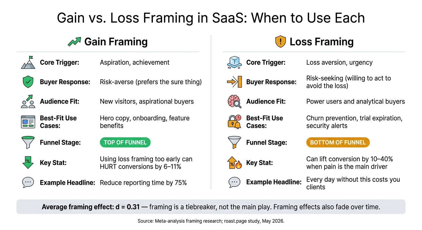
Gain vs. Loss Framing in SaaS: When to Use Each
Framing research usually comes down to two approaches: gain framing and loss framing. On a SaaS website, the better choice depends on what the visitor is ready to do next. Both can work. The catch is that each one tends to work better in a different moment.
Gain framing: when benefit-led wording performs better
Gain framing tends to work best at the top of the funnel, when people are still figuring out the product. At that stage, loss framing can hurt first-session conversions by 6% to 11%.
It also fits decisions that already feel tense or high-stakes. In those moments, fear can slow people down instead of pushing them forward. For SaaS founders building products around productivity, onboarding, or feature value, benefit-led headlines and CTAs give buyers something positive to aim for.
Loss framing: when risk-reduction wording becomes more persuasive
Loss framing works because people tend to feel losses more strongly than equal gains. That’s why security claims and pricing urgency often hit harder when a buyer is close to making a choice.
This frame is strongest at the bottom of the funnel, when doing nothing starts to feel expensive. For SaaS products focused on security, compliance, churn prevention, or trial expiration, loss framing is often a natural fit. In those cases, well-executed loss-framed headlines can lift conversion by 10% to 40% when pain is the main driver.
"Gain frames push people toward risk-aversion. Loss frames push people toward risk-seeking." - Yu-kai Chou, Author and Behavioral Designer
Where framing research is conditional rather than absolute
Neither frame wins every time. Meta-analyses put the average framing effect at d = 0.31. That makes framing more of a tiebreaker than the main play. Results also shift based on how familiar buyers are with the product, how comfortable they are with numbers, and what exact action you want them to take.
Here’s a simple way to think about where each frame tends to fit on a SaaS site:
| Gain Framing | Loss Framing | |
|---|---|---|
| Core trigger | Aspiration, achievement | Loss aversion, urgency |
| Buyer response | Risk-averse (prefers the sure thing) | Risk-seeking (willing to act to avoid the loss) |
| Audience fit | New visitors, aspirational buyers | Power users and analytical buyers |
| Best-fit SaaS use cases | Hero copy, onboarding, feature benefits | Churn prevention, trial expiration, security alerts |
There’s one more wrinkle here: framing effects tend to fade over time. A loss-framed headline might drive an early spike in sign-ups, but the long-term outcome still comes back to the product itself and whether it delivers.
That’s why these choices matter most in the places people see first: the headline, the pricing section, and the proof points that shape the first impression. Identifying these high-impact areas often starts with a competitive analysis of growth gaps to see how rivals frame their value.
How framing changes buyer perception on SaaS websites
Framing changes what a buyer thinks your message means. On a SaaS page, it shapes how people understand the product before they start comparing features. That first read happens fast. And the frame tends to show up most in the parts people scan first: headlines, pricing, and proof.
How framing affects clarity in headlines, subheads, and benefit statements
The headline is usually the first big framing call on a SaaS page. A May 2026 roast.page study gave Stripe's H1, "Financial infrastructure to grow your revenue," an 86/100 because "to grow your revenue" turns a technical product into a buyer outcome. That matters. Outcome-led pages average 60/100, while feature-led pages average 47/100. People grasp results faster than they grasp a list of features.
That’s why specific outcomes like "Reduce reporting time by 75%" land better than vague claims like "industry-leading" or "innovative". One tells the buyer what changes. The other makes them do the work.
The same pattern shows up in subheads and CTAs. Effort framing can soften the ask. "Tell us about your site" feels like a conversation. "Fill out this form" feels like paperwork.
The same framing choices carry over into how buyers read price and proof.
How framing affects trust in pricing, proof, and product claims
Pricing pages aren't just price lists. They're decision environments. $99/month and "less than $3.30/day" mean the same thing, but the daily frame tends to feel smaller. The same goes for annual pricing. Framing a discount as "2 months free" is 16% more effective than "20% off" because a concrete gain is easier to process than abstract math.
Proof works the same way. "Trusted by 5,000+ B2B SaaS founders" says more than "used by growing companies," and a 4.0 to 4.7 rating often feels more believable than a perfect 5.0. Push a claim too far, and it can do the opposite of what you want. Instead of persuading, it makes people doubt what they’re reading.
Small wording shifts matter here too. Swap "30-day money-back guarantee" for "Risk-free for 30 days" to put less attention on the downside. A few words can change how buyers judge risk - and whether they feel ready to move ahead.
Framing patterns that fit common SaaS messaging jobs
Gain and loss framing matter, but most SaaS pages also lean on section-level frames. This is where messaging gets more practical. The best frame depends on two things: where the buyer is in the decision process, and what that part of the page needs to do.
Problem-first, outcome-first, and loss-avoidance frames
Problem-first framing works best when buyers already feel the pain but haven’t picked a fix yet. It starts with the issue they want to solve, which makes it a good fit for hero subheads and solution pages. Research shows problem-focused headlines can increase CTA click-through rates by 20–40%.
Outcome-first framing works well on landing pages that need to convert. Instead of leading with features, it leads with the result the buyer wants. That shift can change how the whole page lands. Pages with outcome-driven H1 headlines average a score of 58/100 versus 44/100 for feature-led pages. Use it in homepage hero copy and case study headers.
Loss-avoidance framing leans on loss aversion to push action when buyers are close to a decision. This frame tends to work near the bottom of the funnel, where the risk feels immediate. In A/B tests, loss-framed headlines can produce a 10–40% lift in conversion rates over gain-framed versions. Use it carefully in pricing, trial-expiry, and security sections where the risk is real.
Attribute framing: turning features into perceived benefits
Attribute framing changes how you present a fact without changing the fact itself. A simple example: “99% uptime” and “1% downtime” mean the same thing, but they don’t hit the same way.
The same pattern shows up in lines like “ready in under 2 minutes” or “no SEO expertise required.” Those phrases take a plain product detail and make the benefit easier to feel. Numbers and timeframes do a lot of work here. Specific anchors like these can lift page scores by 9 points on average compared with vague claims.
The job is simple: move each feature from a technical fact to a measurable benefit.
Using one frame per section to avoid mixed signals
Each section should stick to one main frame. If you mix problem-first, outcome-first, and loss-avoidance ideas in the same block of copy, the message gets muddy. The reader has to work harder to figure out what matters, and that weakens the section.
Practical takeaways for testing and refining SaaS messaging
Messaging rules drawn from framing research
These findings can turn into simple page-level rules. Use aspirational framing at the top of the funnel, risk-reduction framing near conversion, and stick to one frame per section. You can also test a loss-framed H1, then use gain-framed body copy to show the payoff.
That setup works because the headline gets attention fast, while the rest of the page shows what the reader stands to gain. It keeps the message sharp instead of pulling people in two directions at once.
How to validate framing changes using real website comparisons
Once you set the frame, check whether it stays consistent across your highest-value pages. A quick side-by-side look at your site and a competitor's can make weak spots easier to see.
Use Competitor Analysis Tool to compare your homepage, pricing page, and benefit statements against a competitor's site in under 2 minutes. It surfaces messaging, demand, and visibility gaps so you can prioritize changes fast.
That kind of comparison helps you spot where framing is clear, weak, or inconsistent. In plain terms, you can see where your message lands cleanly and where it starts to drift.
Conclusion: The framing choices that matter most
Framing shapes perception before buyers read a feature. That means the way you position a section can influence how the rest of the page is read.
Apply framing deliberately by section, based on buyer stage and perceived risk. Then validate it against a competitor's messaging to see where your framing holds and where it needs work.
FAQs
How do I choose the right frame for each page?
Start with your audience’s mindset and where they are in the funnel.
Use gain framing when you want to show what people can get. It works well in onboarding, feature pitches, and top-of-funnel content because it points to the upside and helps people picture a better outcome.
Use loss framing when urgency matters more. This frame fits churn prevention and high-stakes offers, where the cost of doing nothing needs to feel clear.
For high-risk, anxiety-sensitive decisions, don’t force one frame every time. Match the frame to the user’s situation, and lead with reassurance so the message feels steady instead of pushy.
When should I use loss framing without hurting conversions?
Use loss framing in late-funnel moments, when people already have something on the line.
That could be:
- saved data
- streaks
- set workflows
- limited-time offers
- security steps
- churn-risk moments
- the cost of doing nothing
In these cases, loss framing works because the user isn't thinking in the abstract anymore. They can see what might slip away, and that makes the message hit harder.
But don't use it for anxiety-sensitive choices like financial planning, insurance, or medical advice. In those moments, extra pressure can backfire.
And don't plaster it everywhere. If every message sounds urgent, aggressive, or high stakes, people tune it out. The framing loses its punch.
What should I test first on a SaaS site?
Start with your hero section headline and subheadline. People read them in the first five seconds. That opening sets the tone for everything that follows, which makes it the highest-leverage place to test.
Test gain vs. loss framing. And put specific, measurable outcomes next to broad benefit claims.
For example:
“save 5 hours a week”
works better as a test than:
“efficient workflow tool”