
Ultimate Guide to Visitor Behavior Analysis
Pair funnel metrics with session recordings and heatmaps to find drop-offs, remove friction, and boost SaaS retention.

Most of your conversion problem is hidden if you only look at pageviews. If I want to find why visitors leave, I need to track where they drop off, watch what they do on key pages, and fix the exact point of friction. The article’s main point is simple: pair funnel metrics with behavior signals so I can spot leaks in acquisition, activation, engagement, retention, and monetization, or analyze competitor website performance to find external benchmarks.
Right away, here’s what matters most:
- Pageviews alone miss most buying signals.
- I should track a small event set first, not everything.
- The best starting journey is often Landing Page → Pricing → Signup.
- I should use quantitative data to find the leak and qualitative data to explain the cause.
- Common friction signs include rage clicks, dead clicks, scroll drop-off, form hesitation, and backtracking.
- I need to review behavior by device, traffic source, and user segment.
- Each fix should become one testable hypothesis.
A few numbers from the article stand out:
- 73% of product decisions still rely on pageview metrics.
- Behavioral data can give 4.2x more actionable insights than pageview-only data.
- SaaS teams that track user behavior can see 25–30% better retention.
- Activated users often retain 3–5x better than users who never activate.
- Pricing-page visitors who scroll down and then back up can convert at 2.1x the rate of straight scrollers.
If I had to boil the whole piece down into one working system, it would be this:
- Pick one goal
- Map one journey
- Track about 20 core events
- Watch the highest-drop-off sessions
- Ship one fix each week
The article then walks through the metrics to track, the tools to use, and how to turn those findings into growth decisions without guessing.
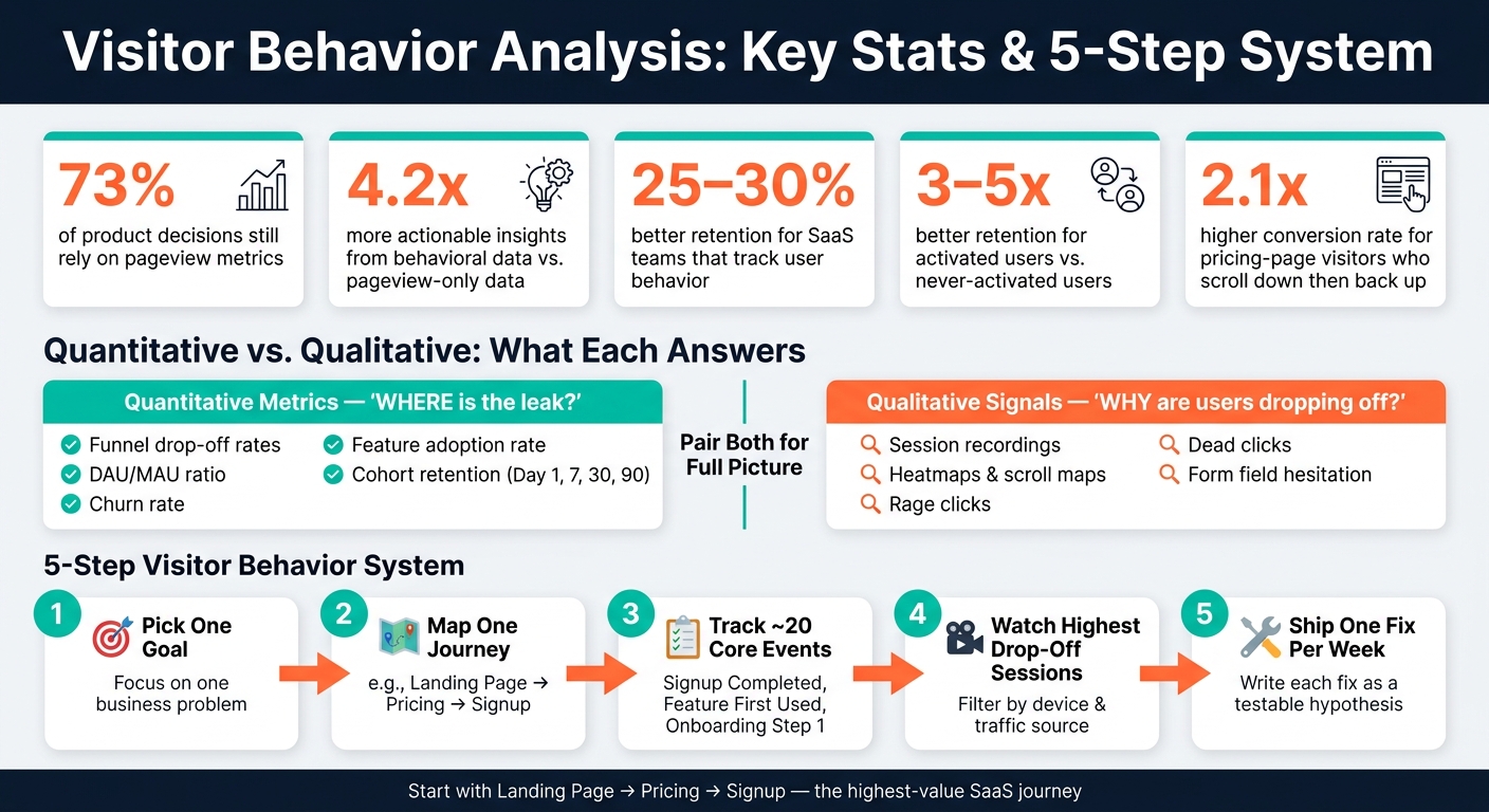
Visitor Behavior Analysis: Key Stats & 5-Step System
How To Track User Behavior in SaaS – 6 Key Strategies
sbb-itb-0a8c96a
The Core Metrics and Signals to Track
Track the metrics that match each SaaS stage. That sounds obvious, but many teams still miss it. 73% of product decisions are still based on pageview metrics, even though behavioral data gives 4.2x more actionable insights than pageview data.
The goal is simple: use acquisition, activation, engagement, retention, and monetization metrics to find where the leak begins.
Quantitative Metrics for Pages, Funnels, and Retention
Quantitative metrics show you where things start to break.
- Acquisition: Page views, CTA clicks, form submissions - what drives early intent
- Activation: Signup completion rate, time-to-first-action, onboarding step completions - whether users reach the product’s core value
- Engagement: Daily active users to monthly active users (DAU/MAU) ratio, feature adoption rate, session length - whether users are forming a habit
- Retention: Cohort retention curves (Day 1, 7, 30, 90), churn rate, return rate - whether the product keeps delivering value
- Monetization: Trial-to-paid conversion, upgrade rate, LTV - which behaviors point to pipeline and expansion
A good rule: track no more than 20 core events. Start with events such as "Signup Completed", "Feature First Used", and "Onboarding Step 1 Finished."
That focus matters. Activated users retain 3–5x better than users who never activate. So if you want one number to watch closely, make it time-to-first-action.
Once you know where the leak is, behavior signals help explain what caused it.
Qualitative Signals That Explain Friction
The main qualitative signals are session recordings, heatmaps, scroll maps, form analytics, and frustration events such as rage clicks, dead clicks, and rapid backtracking.
Session recordings show what happened right before drop-off, including pauses, hesitation, and backtracking. Heatmaps show where attention clusters on a page. Scroll maps tell you whether visitors even make it to your pricing section or CTA. Form analytics show which fields trigger hesitation, errors, or abandonment during signup.
There’s a useful pattern on pricing pages: scroll reversals often show active consideration. Visitors who scroll down a pricing page and then scroll back up convert at 2.1x the rate of those who scroll straight through.
Start your qualitative review after quantitative data has already pointed to the problem page. Then watch recordings from the segment with the biggest drop-off, filtered by device type and traffic source. That way, you’re not guessing or watching random sessions.
Numbers show where users drop. Qualitative signals show why.
Table: Quantitative vs. Qualitative Behavior Data
| Metric Type | Common Examples | Question It Answers | When to Use It |
|---|---|---|---|
| Quantitative | Funnel drop-off, DAU/MAU, churn rate, feature adoption rate | What is happening and where is the leak? | Prioritizing which funnel stage or page to fix first |
| Qualitative | Session recordings, heatmaps, rage clicks, form analytics | Why are users dropping off or hesitating? | Diagnosing the specific UX or messaging issue on a high-drop-off page |
| Friction signals | Dead clicks, rapid backtracking, repeated backtracking | Is the UI broken or sending mixed signals? | Catching confusing interactions before they compound |
How to Build a Visitor Behavior Tool Stack
Use one tool per question. Once you know where visitors drop off and where friction shows up, pick tools that answer those exact questions.
What Each Tool Category Is Actually For
Each tool should do one job:
- Web analytics: shows traffic sources and page paths
- Product analytics: shows feature adoption and what drives retention
- Session replay and heatmaps: show where users pause, hesitate, or get stuck - Microsoft Clarity is free and has no traffic limits
- Form analytics: shows which field causes abandonment
- Visitor identification: identifies likely companies behind anonymous visits
- Marketing attribution: connects early touches to revenue
Used together, these tools show both traffic and friction. That matters, because traffic tells you how people arrive, while behavior shows what gets in their way once they’re there.
How to Set Up Tracking for a SaaS Site and Product
Start with the highest-value journey - usually Landing Page → Pricing → Signup. Don’t track everything at once. Track the events you need to diagnose that path.
A good starting set includes Signup Completed, Pricing Page Viewed, Onboarding Step 1 Finished, and Feature First Used.
From day one, use a consistent naming system. A simple hierarchical pattern makes reports much easier to work with later. Add properties like plan_type or page_url so events stay easy to query. If naming gets messy early, the cleanup work can turn into technical debt fast.
Before anything goes live, validate every event in a staging environment. Then break reports down by traffic source, device type, and intent. Averages can blur what’s happening. A signup flow might look fine overall, but mobile visitors from paid search could be dropping at a much higher rate.
With tracking in place, you can compare drop-offs by traffic source, device, and journey stage instead of guessing.
Where Competitor Analysis Tool Fits In

On-site data explains behavior. Positioning data helps you figure out whether the issue comes from site friction or weak market fit.
Competitor Analysis Tool fits into the demand and positioning layer of your stack. It compares your site with a competitor’s to show visibility gaps, messaging differences, and demand you’re missing. If your behavior data shows low engagement on a feature page, competitor analysis can help you tell whether the problem is a visibility gap or a messaging gap.
That changes the problem from a fuzzy “users aren’t converting” complaint into something much more specific and easier to fix.
| Stack Layer | Tool Category | Business Question |
|---|---|---|
| Traffic & Sessions | Web Analytics | Where did visitors come from? |
| Feature & Retention | Product Analytics | Which actions lead to long-term use? |
| UX Friction | Session Replay / Heatmaps | Where did users struggle or hesitate? |
| Signup Friction | Form Analytics | Which field is causing abandonment? |
| Revenue Attribution | Marketing Attribution | Which channels produced actual revenue? |
| Demand & Positioning | Competitor Analysis | Where are our messaging and visibility gaps? |
How to Turn Visitor Behavior Data Into Growth Decisions
Once you know where the leak is, use behavior data to find growth gaps and decide what to fix.
Find the Biggest Drop-Offs First
Start with the path that matters most to the business. Then look for the step with the biggest drop-off. Before you decide what's wrong, break that step down by device, traffic source, and user type. That keeps you from blaming the page when the issue may only affect, say, mobile visitors from paid traffic.
Diagnose the Cause With Behavior Evidence
After you know where people drop off, use qualitative data to figure out why. Watch 20–30 session recordings of users who abandoned at that exact step. You're looking for signs of friction:
- Rage clicks: rapid clicking on a non-functional element
- Dead clicks: clicking on something that doesn't respond
- Immediate backtracking: landing on a page and quickly returning to the previous one
These signals usually point to different problems. Rage clicks often mean something is broken, or the UI looks clickable when it isn't. Dead clicks usually mean users expect an action, but the label or design doesn't make that clear. Immediate backtracking is often a message-match issue, not a design issue.
Hesitation on product or spec pages usually points to uncertainty, not price.
Use heatmaps to check one thing: do visitors even reach the trust signals and CTA? If people aren't scrolling past the fold on your pricing page, then your key trust signals and FAQs are out of sight for most of them. Put the answer right next to the moment of hesitation.
If one field causes exits on your signup form, remove it. If you can't remove it, add one line of microcopy that explains why it's there.
Table: From Behavior Finding to Next Action
Use this table to turn each signal into one clear next step.
| Behavior Finding | Likely Cause | Recommended Action | Expected Impact |
|---|---|---|---|
| Low scroll depth on landing page | Weak hook or irrelevant content above the fold | Move primary value prop and CTA higher; improve message-match with traffic source | More visitors reach key selling points |
| Pricing-page exits or pricing/FAQ loops | Unanswered objections or missing trust signals near the decision point | Place FAQs, testimonials, and objection answers beside the CTA | Higher pricing-to-signup conversion |
| Rage clicks on CTA | Broken element or JavaScript error | Audit for technical bugs and UI issues on specific devices | Immediate reduction in friction-led drop-off |
| Form field hesitation or abandonment | Privacy concerns or high perceived effort | Reduce fields to the minimum; add inline "why we need this" microcopy | Lower form abandonment rates |
| Low activation after signup | Weak onboarding entry point, not signup friction | Track time-to-first-action; if users don't act within 5 minutes, they are significantly less likely to return | Stronger early retention |
Write each fix as a testable hypothesis before you ship it. For example:
"Adding pricing FAQs near the CTA will cut exits by 15%."
Conclusion: Build a Simple, Repeatable Visitor Analysis System
Treat each fix like a hypothesis, then turn visitor behavior analysis into a weekly habit. That’s where this starts to work. The best results usually come from a tight focus. Traffic numbers tell you how much activity you have. Behavior tells you where the leverage is.
Pick one business problem. Map the journey tied to that problem. Track a short list of events that matter. Then pair the numbers with qualitative evidence. That’s the loop.
Key Takeaways
Keep the system simple: measure the leak, inspect the friction, ship one fix, repeat.
At its simplest, this system has four parts: one goal, one journey, a short event list of about 20 core events, and a weekly review loop. Start with one funnel, fix the biggest leak, then expand.
Use both in every review. Look at the biggest drop-off, check the recordings, and act on one insight each week.
Pageviews are a starting point, not the decision layer. To close that gap, you need a process you can run again and again.
FAQs
What events should I track first?
Start with the events that connect straight to revenue and your main conversion goals.
Map the user journey around that goal. Then look for the moments where people have to think, type, wait, or trust. Those are often the spots where drop-off happens.
Keep your tracking tight. In most cases, 20 to 30 core events is enough to start. Good examples include:
- Signups
- Trial starts
- Form submissions
- Feature usage
Name events in a way that keeps the context attached. So instead of something vague like trial_started, use something like trial_started_from_pricing_page.
That small bit of detail makes your data much easier to read later.
How do I find the biggest conversion leak?
Map your main funnel first. Then find the step where the biggest share of people drop off, with extra attention on high-impact paths like pricing-to-trial or landing-page-to-demo.
Next, match that funnel data with session recordings and heatmaps for that exact step. You're looking for signs of friction: rage clicks, dead clicks, form hesitation, or U-turns.
Once you spot a pattern, keep the hypothesis narrow. Make one focused change, then measure what happens.
Which behavior signals matter most?
Focus on signals that point to high intent, trust gaps, or friction. That includes repeat visits to key pages like pricing or documentation, long pauses, scroll reversals, and repeated hovering without clicking.
It also helps to look hard at funnel drop-off points, rage clicks, and abandoned form fields. For B2B, IP-to-company identification can help you spot accounts that are doing independent research on their own time.