
How To Benchmark Navigation Efficiency For SaaS Sites
Benchmark SaaS navigation using task completion time, click depth, and tree tests to reveal friction and improve user success.
Navigation is more than just menus - it's how users understand your SaaS site. Poor navigation frustrates users, increases drop-off rates, and drives up support tickets. If users can't find what they're looking for, they'll leave. Fixing navigation can improve task completion rates by 15–25% and cut support tickets by 20–30%.
Key Metrics to Measure Navigation
- Task Completion Time: How long users take to finish key actions. Long times signal friction.
- Click Depth: Number of clicks to reach important pages. More clicks = higher drop-offs.
- Bounce & Exit Rates: Where users disengage. High rates often mean unclear navigation.
How to Benchmark Navigation
- Map Your Site: Identify critical pages and tasks.
- Compare Competitors: Analyze 3–5 direct and indirect competitors for navigation clarity.
- Standardize Testing: Test on both desktop and mobile with consistent scenarios.
Tools to Use
- Analytics: GA4 Path Exploration helps track user paths.
- Heatmaps: Microsoft Clarity shows where users click or stop scrolling.
- Tree Testing: Tools like UXtweak evaluate menu structure clarity.
Quick Fixes
- Limit menus to 5–7 items.
- Use clear, task-oriented labels.
- Optimize mobile navigation for thumb-friendly access.
Improving navigation isn’t just about design - it’s about performance. Data-backed changes can make your SaaS site easier to use and more effective at retaining users.
How to Design Your SaaS Site Navigation
sbb-itb-0a8c96a
Key Metrics for Measuring Navigation Efficiency
To create a framework that improves your site's navigation, you need to start by measuring the right metrics. Three stand out for giving a clear picture of user movement through your SaaS site: task completion time, click depth, and bounce and exit rates. Each metric highlights specific friction points users encounter. Let’s dive into what each one reveals.
Task Completion Time
This measures how long it takes users to complete key actions. If users are spending too much time, it often signals unclear labels or inefficient navigation paths. The real insight isn’t just whether users complete a task, but how much effort it takes them to get there.
For example, long completion times might mean your navigation labels don’t align with how users think about your product. Even slight delays matter - a one-second delay in interface response time can reduce customer satisfaction by 16%.
When analyzing task completion time, focus on frequently performed actions first, or analyze competitor website structures to see how they prioritize tasks. Improving these has a much bigger impact than tweaking rare edge cases. Also, exclude abandoned tasks from your averages to avoid skewing your data.
After task completion time, the next key metric is click depth.
Click Depth
Click depth measures how many clicks it takes for users to reach a specific page. The more clicks required, the higher the cognitive load - and the more likely users are to give up.
First-click accuracy is critical, predicting task success with 87% accuracy. If a user’s first click leads them in the wrong direction, the chances of completing their task drop significantly. A good rule of thumb: important pages like pricing, features, or contact should be no more than 2 to 3 clicks from any entry point. If users rely heavily on internal site search - over 20% of the time - to find key content, it’s a red flag that your main navigation isn’t working well.
Finally, let’s look at bounce and exit rates to understand where users disengage.
Bounce and Exit Rates
Bounce and exit rates show where users are abandoning your site and why. While these are often seen as general engagement metrics, they’re also powerful tools for diagnosing navigation issues.
"A clear navigation structure acts as a map that helps users understand the website and find relevant information quickly." - Lena Tarhonska, CEO, Vezert
A high bounce rate suggests users land on a page but can’t figure out where to go next. On the other hand, a high exit rate on a specific page points to a mid-journey failure, where navigation doesn’t guide users to a logical next step. Research shows that 50% of users will abandon a site entirely if they find the navigation confusing. On the flip side, clear navigation can cut drop-off rates in half.
| Metric | What It Signals | Where to Look |
|---|---|---|
| Task Completion Time | Navigation friction and cognitive effort | User testing, session recordings |
| Click Depth | Efficiency of paths and content hierarchy | Analytics click-path reports |
| Bounce Rate | Entry-point navigation problems | Landing page analytics |
| Exit Rate | Navigation breakdown mid-journey | Page-level exit reports |
How to Build a Navigation Benchmarking Framework
Once you’ve identified your key metrics, the next step is creating a framework to keep your benchmarking organized. A solid framework should answer three key questions: What will you test? Who will you compare against? And under what conditions?
Defining Pages and User Tasks
Start by mapping your entire navigation structure, including primary menus, secondary menus, footers, and utility links. From there, focus on 5–10 essential user tasks. These tasks should be informed by data, such as support tickets, user interviews, or analytics showing high-exit pages.
When defining tasks, phrase them as goal-oriented scenarios. For instance, instead of directing users to "find the pricing page", you could ask them to "find the cost of the Premium plan for 50 users". This approach mirrors real-world user goals. A well-designed navigation system should achieve at least a 75% direct success rate in tree testing.
Once your tasks are clear, the next step is identifying competitor sites for comparison.
Selecting Competitor Sites for Comparison
Select 3–5 direct competitors and 1–2 indirect competitors. Direct competitors help you assess standard labels and common navigation patterns. Indirect competitors - those solving similar problems in different ways - can provide insights into alternative approaches that your audience might already recognize.
It’s also helpful to include one aspirational competitor. This could be a product outside your industry that’s widely praised for its clear navigation. To identify these, ask your sales team which products often come up in competitive discussions, and check user reviews on platforms like G2 and Capterra. Tools like Competitor Analysis Tool can also highlight gaps in visibility or messaging between your site and others, giving you a data-backed starting point.
| Competitor Type | Purpose in Benchmarking |
|---|---|
| Direct | Compare core task completion and standard labels |
| Indirect | Identify alternative navigation patterns |
| Aspirational | Set a benchmark for navigation clarity |
| Small Player | Spot bold or unconventional architecture choices |
These comparisons can uncover actionable insights to improve your navigation’s performance.
Standardizing Devices and Testing Conditions
After selecting competitors, it’s crucial to standardize your testing environment. Consistency ensures that your comparisons are fair and the data you collect is actionable. Always use fresh accounts for testing - existing accounts might skip onboarding steps and distort the experience for first-time users. Test all competitors within the same session, using the same 3–5 tasks across every site.
Separate desktop and mobile testing, as mobile environments often expose "navigation bloat" that might go unnoticed on larger screens. Use the latest browser version and apply consistent performance metrics, such as click count, steps required, task success rate, and time to task completion. If you’re benchmarking after a redesign, allow for a 2–5-week adjustment period before testing.
"Test navigation structure separately from visual design - tree testing reveals information architecture problems that get masked by attractive visuals." - ValidateThat
How to Collect and Analyze Navigation Data
To understand how users interact with your website, combine quantitative tools to track user actions with qualitative methods that uncover the "why" behind their behavior.
Using Analytics and Heatmaps
Start with GA4's Path Exploration. This tool maps out the sequence of pages users visit, with the thickness of connection lines representing traffic volume. It’s incredibly useful for spotting issues like:
- "The loop": Users cycling through the same pages repeatedly, which often points to missing or unclear information.
- Unexpected drop-offs: Abandonment on high-traffic paths, signaling potential obstacles.
Pair GA4's insights with heatmaps from Microsoft Clarity, a free tool with no traffic limits. Heatmaps highlight which menu items get clicks, which are ignored, and where users stop scrolling. As Kieran Singh, a Digital Marketing Manager, explains:
"As a digital marketer, Microsoft Clarity is one of my absolute favorite tools. It's perfect for visualizing data to stakeholders and helps justify why changes need to be made."
Once you’ve identified patterns, it’s time to dig deeper by observing real user behavior.
Session Recordings and Usability Testing
Session recordings allow you to watch users as they navigate your site. These recordings can reveal key behaviors like rage clicks, hesitation on menu items, or an over-reliance on site search. If more than 20% of users rely on internal search to find key content, it’s a sign your navigation isn’t working effectively.
To go deeper, conduct moderated usability sessions with 8–12 participants. Use a think-aloud protocol, where participants narrate their thought process as they complete tasks. Design tasks as realistic scenarios, such as: “Find the cost of the Premium plan for 50 users.” This approach yields far more actionable insights than direct instructions like “Go to the pricing page.”
Pay close attention to first-click data during these sessions - it predicts task success with 87% accuracy. If participants consistently click the wrong menu item first, you’ve likely got a labeling issue to address.
"Watching real users interact with our platform - in all their scrolls, pauses, rage taps, and exits - helped us identify friction points that numbers alone couldn't surface." - Paras Makhija, B2C Growth Strategist
For a structural assessment of your navigation, consider tree testing.
Tree Testing for Navigation Clarity
Tree testing is a great way to evaluate whether your site’s information architecture is causing confusion. It strips away visual design, presenting users with a plain-text menu hierarchy, and asks them to locate specific items. This isolates structural issues like unclear labels, poor groupings, or excessive menu levels.
Measure two key metrics during tree testing:
- Success Rate: Did users find the correct page?
- Directness: Did they navigate straight to it, or did they wander first?
If users have low directness but still manage to find the right page, it suggests your labels are unclear, causing unnecessary detours. For B2B SaaS companies, a task like "Find Pricing" should achieve a 95–99% success rate. Anything lower indicates a serious problem with your top-level navigation.
Tools like UXtweak offer free tree testing options, while ValidateThat provides a free-forever plan with unlimited studies. These tools can help you refine your navigation structure to better meet user needs.
Turning Data into Benchmark Scores and Insights
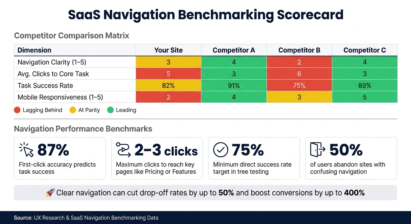
SaaS Navigation Benchmarking: Key Metrics & Performance Benchmarks
Once you've gathered analytics, session recordings, and tree testing data, the next step is to convert that raw information into actionable benchmark scores and insights. Data by itself won't reveal whether your navigation outshines or falls short of a competitor's - it needs structure and context for meaningful comparisons. This is where a systematic approach comes into play.
Building a Comparison Table
A straightforward way to analyze your findings is by creating a comparison matrix. Choose 3–5 direct competitors and evaluate them across key metrics such as navigation clarity, click depth, task success rate, and mobile responsiveness. For subjective elements like label clarity, use a scoring system from 1 (Poor) to 5 (Excellent) to quantify observations.
Here’s an example of what your comparison table might look like:
| Dimension | Your Site | Competitor A | Competitor B | Competitor C |
|---|---|---|---|---|
| Navigation Clarity (1–5) | 3 | 4 | 2 | 4 |
| Avg. Clicks to Core Task | 5 | 3 | 6 | 3 |
| Task Success Rate | 82% | 91% | 75% | 89% |
| Mobile Responsiveness (1–5) | 2 | 4 | 3 | 5 |
To make the table more visually intuitive, use color-coding: red for areas where your site lags behind at least two competitors, yellow for parity, and green for areas where you lead. This visual aid helps stakeholders quickly pinpoint areas needing attention.
"Your users do not evaluate your product in isolation - they compare it against every other tool they use, especially direct competitors." - validateThat.io
Identifying Gaps and Setting Benchmarks
With your comparison table ready, the next step is to identify specific gaps in your navigation. Focus on two primary types of gaps:
- "Table stakes" gap: These are essential features or functionalities that all competitors offer but your site lacks.
- Structural gap: This involves measurable disadvantages, like requiring more clicks to complete a task or having lower task success rates.
For example, if competitors allow users to reach a core feature in 2–3 clicks while your site takes 5, that's a clear disadvantage you can address.
To set improvement targets, apply the 75th percentile rule - aim for 75% of users to experience better navigation performance. Use metrics like Google's Core Web Vitals to track progress. Then, prioritize your efforts by ranking gaps using the RICE framework (Reach, Impact, Confidence, Effort). This ensures you focus resources effectively and avoid spreading them too thin.
For a quick competitive analysis, tools like Competitor Analysis Tool can help you identify visibility and messaging gaps in just a couple of minutes. These insights will guide your efforts to refine and streamline your SaaS site's navigation, making it more user-friendly and competitive.
How to Prioritize and Apply Navigation Improvements
Now that you’ve got your benchmark scores and gap analysis, it’s time to get down to business: prioritizing fixes. Start by focusing on the issues that have the most significant impact on users. A good rule of thumb? If three or more users repeat the same navigation error during testing, treat it as a structural problem - not just a random occurrence. And if a task has a success rate below 70%, it should jump to the top of your priority list.
To stay organized, group issues into three categories: Adopt (quick, low-effort fixes), Differentiate (opportunities for big wins), and Monitor (areas where you’re already doing well). This approach keeps your team focused on what matters most, avoiding the temptation to fix everything at once.
Simplifying Menu Structures
When it comes to primary navigation, less is more. Stick to 5–7 items max to align with Miller’s Law and the limits of short-term memory. And for configuration options, avoid lumping everything into a single "Settings" menu. Instead, split it into clear categories like "My Account" for personal settings and "Workspace Settings" for team or admin controls.
"The best navigation redesign is usually the one that removes a decision, not the one that adds a feature." - Figr
Streamlining menus like this can lead to impressive results: a 15–25% boost in task completion rates for new users and a 20–30% drop in navigation-related support tickets.
While desktop menus are important, don’t overlook the need for a tailored mobile navigation strategy.
Improving Mobile Navigation
Mobile navigation isn’t just about shrinking your desktop layout - it needs a design of its own. Purpose-built mobile experiences often outperform simple responsive adaptations, and testing mobile-specific navigation has shown a 38% win rate, with conversion improvements ranging from 5% to 12%.
One of the best changes you can make? Move primary navigation into the thumb zone - the lower half of the screen. Bottom tab bars can cut thumb reach time by about 50% compared to placing navigation at the top. If a full bottom bar doesn’t fit your design, try a hybrid approach: show 3–5 primary links and tuck the rest into a "More" menu. Avoid relying solely on hamburger menus, as they tend to make your site’s structure harder to discover. And don’t let sticky headers hog too much space - keep them slim, taking up no more than 20–30% of the screen height on mobile.
Beyond structural tweaks, clear and intuitive labels are key to a smooth user experience.
Improving Label Clarity
Unclear labels are a common problem - and one that’s relatively easy to fix. If users don’t know where a link will take them before clicking, they might end up guessing wrong or turning to search as a last resort. A spike in search usage right after scanning the navigation menu is a clear sign that your labels aren’t pulling their weight.
"Navigation works when users can predict where something belongs before they click." - Figr
The fix? Swap out internal jargon or branded terms for plain, task-oriented language. If your card sorting or benchmarking data shows users consistently prefer simpler terms, follow their lead. For instance, replace "Purchase History" with "Orders", "Automations" with "Workflows", or "Segments" with "Groups." And if card sorting reveals isolated items - features that don’t fit neatly into any group - consider renaming or repositioning them.
Conclusion: Using Data to Make Better Navigation Decisions
Improving navigation efficiency isn’t a one-and-done task - it’s an ongoing commitment. By relying on metrics like task completion times, click depth, and label clarity, you can replace assumptions with measurable insights. This approach helps you see navigation not just as a design feature but as a critical business tool that directly impacts user satisfaction and performance.
The stats tell the story. Streamlined navigation can cut user drop-off rates by up to 50%. A full UX revamp? That can boost conversion rates by as much as 400%. These results come from pinpointing areas of friction, addressing them effectively, and validating changes with data.
"If you read a competitor's site as 'design', you see aesthetics. If you read it as 'data', you see strategy." - Seeto
This mindset shift makes competitive benchmarking a game-changer. Tools like Competitor Analysis Tool simplify the process, revealing gaps in demand, messaging, and visibility - all without requiring advanced SEO knowledge. A free analysis takes just 2 minutes and provides actionable insights to guide your next steps.
The objective isn’t to mimic competitors but to understand user expectations, spot weaknesses in the market, and create navigation that genuinely stands out. Start with the data, tackle the most impactful issues first, and keep refining. That’s the recipe for building navigation that works - and keeps working.
FAQs
What are the best tasks to benchmark on a SaaS site?
When it comes to benchmarking, the most effective tasks to focus on are the core user workflows that directly impact conversions and user satisfaction. These workflows typically include:
- Finding pricing information: Ensuring users can quickly locate and understand pricing details.
- Verifying security compliance: Helping users confirm that your product or service meets their security needs.
- Reading customer case studies: Allowing users to see real-world success stories and build trust.
- Downloading resources: Making it easy to access whitepapers, guides, or other helpful materials.
- Locating API documentation: Ensuring developers can quickly find the technical details they need.
- Checking system status: Providing clear and accessible updates about system performance or outages.
By concentrating on these tasks, you can measure how smoothly users achieve their goals, uncover friction points, and refine navigation and overall user experience.
How many users do I need for reliable navigation testing?
When conducting navigation testing, aim to include 15-50 participants for reliable results. For tree testing, which focuses on success or failure rates, 15-30 participants are usually enough to gather clear insights. However, for B2B websites, you should consider testing with 30-50 participants to ensure the findings are statistically reliable.
Most tests typically run for 3-7 days. While 15 participants is the minimum for basic feedback, having 30-50 participants provides a deeper and more thorough understanding of user behavior.
How often should I re-benchmark navigation after changes?
It's a good idea to conduct a full navigation review once a year. On top of that, running quarterly quick tests can help you keep up with any updates your competitors make. If you implement major changes to your site's navigation, be sure to test again to ensure those adjustments are working as intended. This approach helps keep your site user-friendly and aligned with what your audience needs.